RILASTIL
Product
Campaign
Client
Rilastil
Agency
Transmission Creative HK
Industry
Personal Care Product Manufacturing
Category
Print Ads, Website, Digital and Social Ads

Project Overview
A full visual identity and multi‑channel campaign for RILASTIL, an Italian dermatological skincare brand. The project spans concept development, product photography direction, and integrated campaign rollout, balancing Italian dermatological heritage with modern beauty expression.
Challenge
RILASTIL needed a refreshed campaign identity that could unify multiple product lines while elevating its dermatological credibility across print, digital, outdoor, and social media touchpoints. The goal was to create a system that feels premium, scientific, and emotionally resonant for modern beauty consumers.


Approach
Brand & Visual System
-
Developed a clean, clinical visual language rooted in RILASTIL’s Italian laboratory heritage.
-
Directed product photography to highlight texture, clarity, and dermatological precision.
-
Built a modular system adaptable across product lines such as Daily Care, Hydrotenseur, and Aqua.
Campaign Architecture
A structured rollout across five pillars:
-
Print
-
Digital
-
Outdoor
-
Social Media
-
Video
Each channel was designed to reinforce the brand’s dermatological authority and hydration‑focused benefits.
Key Deliverables
Product Identity & Packaging
Created a cohesive identity system for a new product series, including:
-
Micellar Solution
-
Hydrotenseur Concentrate
-
Aqua Hydrating Mask
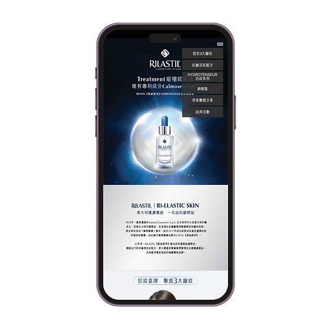
Digital Rollout
Designed a full suite of digital assets, including:
-
Website hero visuals
-
Product feature modules
-
Mobile UI mockups
-
Social media content and influencer‑ready formats
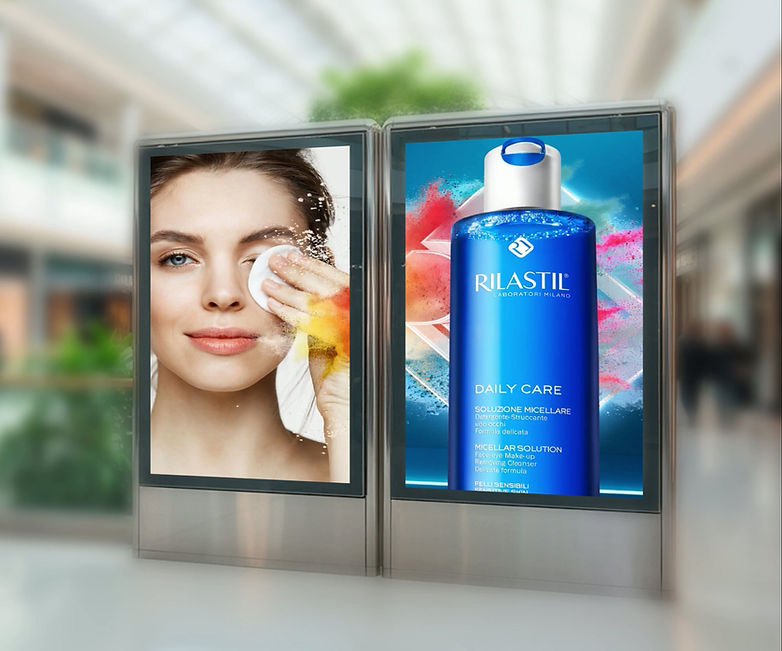
Outdoor & Print Advertising
Delivered high‑impact OOH placements:
-
Bus shelters
-
Billboards
-
Digital screens
Print ads emphasised
-
patented active ingredients
-
anti‑wrinkle benefits
-
dermatological testing
Visual Direction
The campaign uses a blue‑white‑silver palette to communicate:
-
purity
-
hydration
-
clinical trust
Photography direction focused on:
-
clean textures
-
luminous skin
-
scientific clarity
Outcome
The final system delivered:
-
A unified brand world across all channels
-
Stronger product storytelling through dermatological credibility
-
A scalable identity adaptable for future product launches
The campaign positions RILASTIL as a premium, clinically‑driven skincare brand with a modern, international presence.