Senior Consumer Brand Designer
HKJEBN Retail Brand & Rainbow System
Client
HKJEBN
Agency
HKJEBN In-house
Industry
FMCG & Retail
Category
Brand System, Packaging, Retail, Digital

Transforming HKJEBN’s Rainbow Diet identity into a scalable retail brand system across packaging, campaigns, social commerce and digital experiences.
HKJEBN is one of Hong Kong’s leading FMCG and retail brands, operating across a fast-moving ecosystem of 1000+ SKUs, retail promotions, CRM and e-commerce platforms.
Originally developed as a campaign concept, the Rainbow Diet identity lacked consistency across packaging, retail and digital touchpoints. My role focused on evolving this fragmented visual language into a unified brand system that could scale across multiple consumer channels and high-volume production environments.
My Role
Led the development of:
-
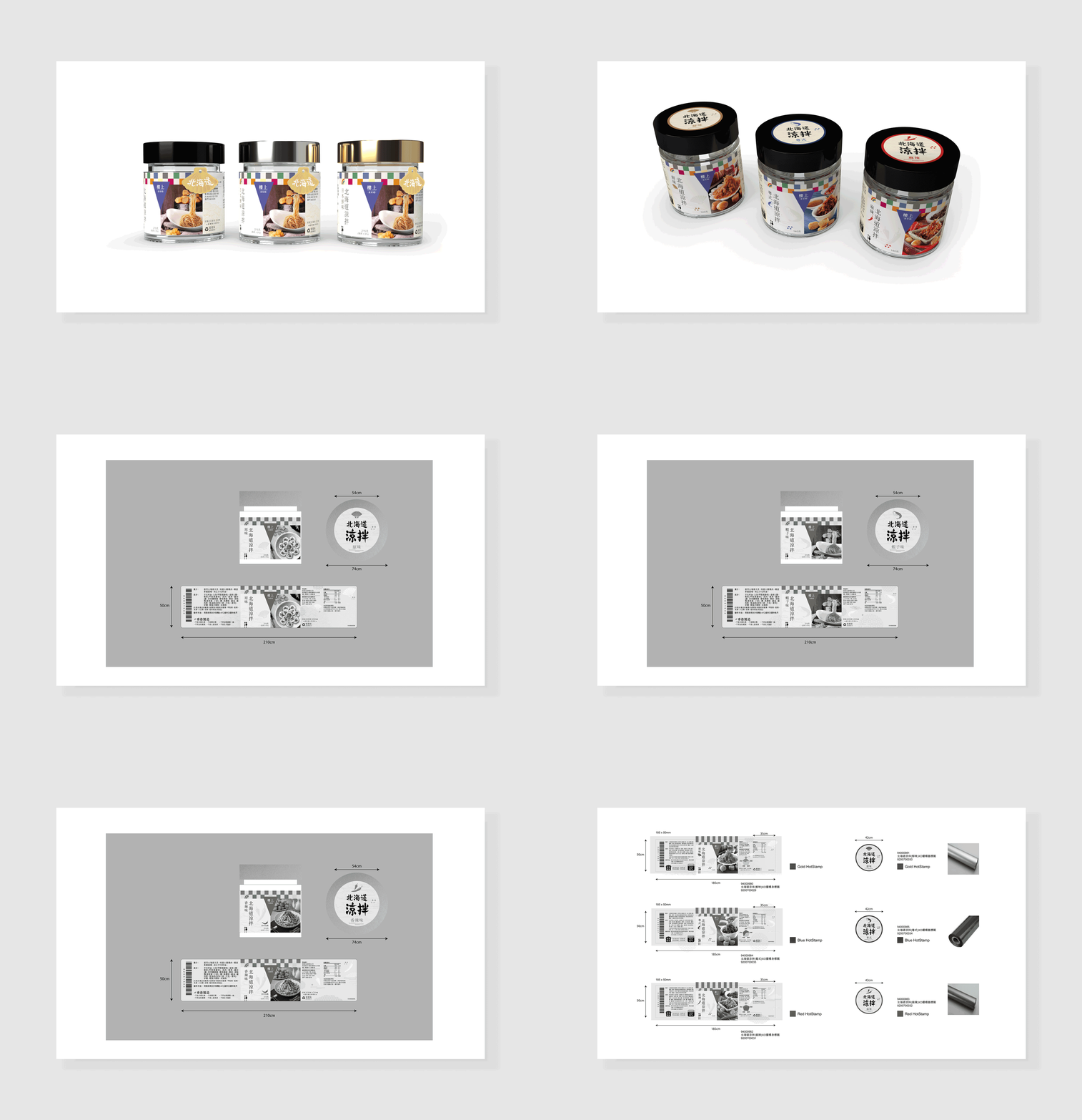
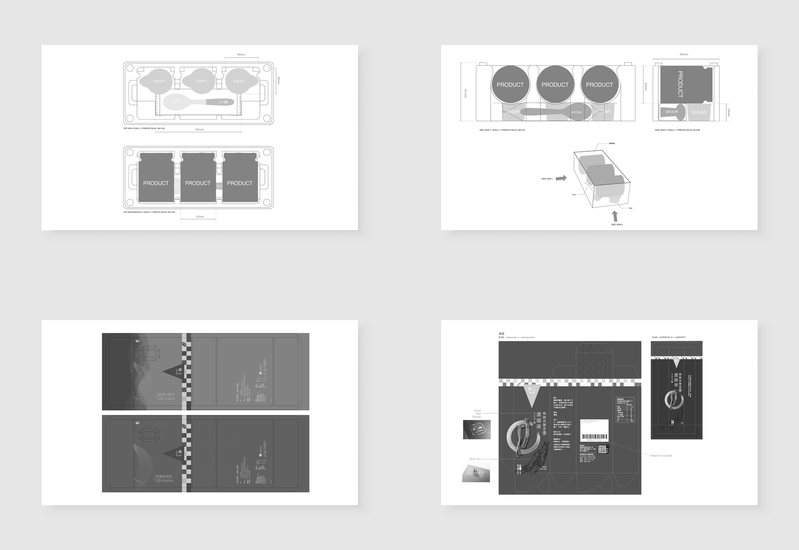
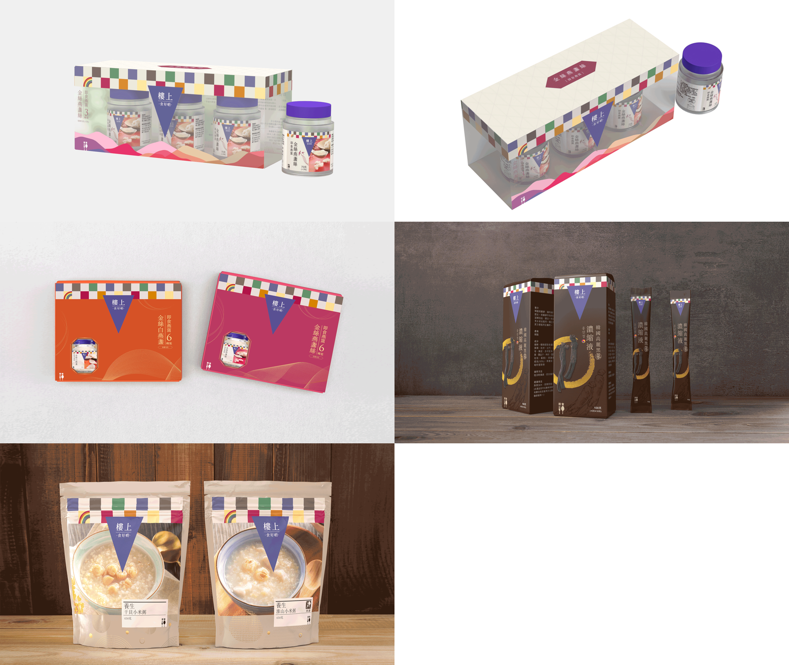
Packaging systems and SKU hierarchy
-
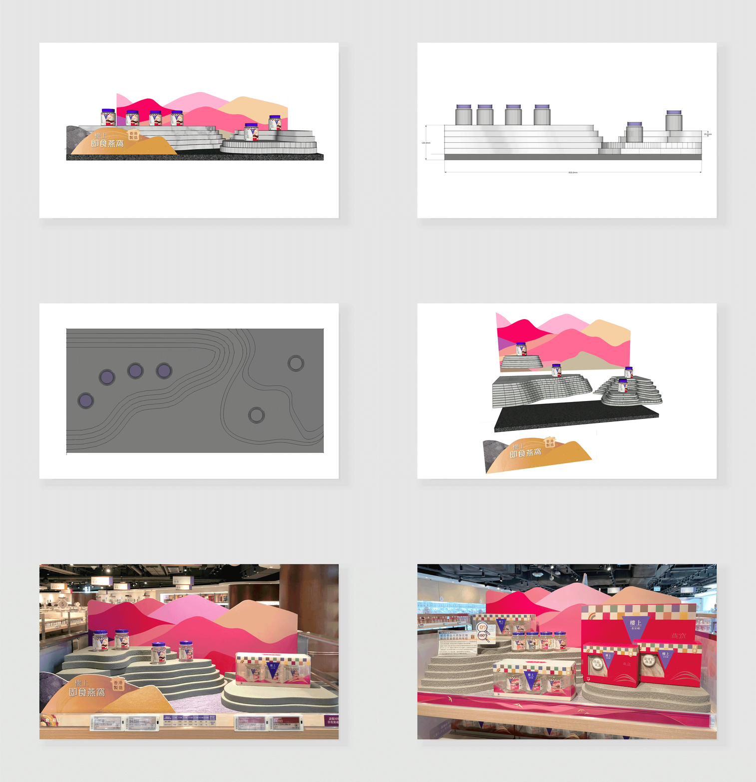
Retail campaign design
-
Social commerce visual systems
-
CRM and app UI direction
-
Cross-channel visual consistency
-
Promotional and seasonal rollout systems
Worked closely with marketing, commercial and production teams to support large-scale retail operations and ongoing campaign cycles.
Approach
The system introduced:
-
Colour-coded product hierarchy
-
Modular packaging layouts
-
Retail and POS visual frameworks
-
Social-first campaign templates
-
CRM and app visual consistency
-
Flexible assets for high-frequency promotional cycles
The visual language was designed to improve navigation, strengthen recognition and support scalable rollout across retail and digital platforms.
Outcome
The refreshed system helped create:
-
Stronger brand consistency
-
Improved SKU clarity
-
Faster production workflows
-
More cohesive retail experiences
-
Scalable frameworks for future expansion
The project transformed HKJEBN’s Rainbow Diet identity from a campaign motif into a scalable multi-platform retail brand system.


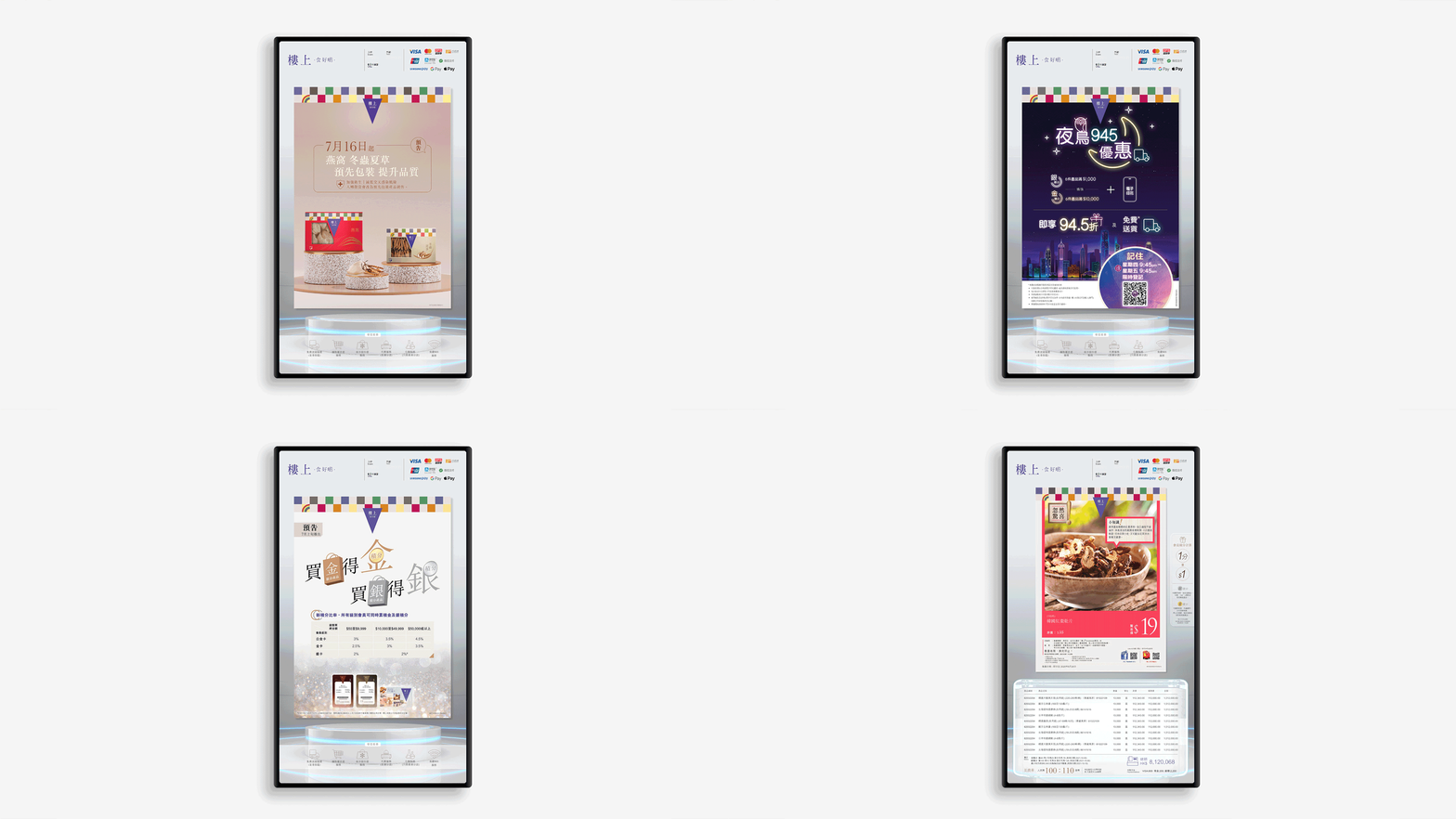


HKJEBN CRM and E-commerce Ecosystems


HKJEBN Social Media


HKJEBN APP UX & UI

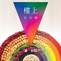
Previous Brand Image


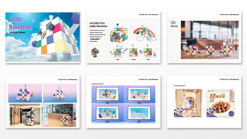
Little Rainbow — Character System
Little Rainbow is a modular character system created to introduce a new brand KOL for HKJEBN. Built as a colourful cube‑based mascot, the character embodies curiosity, exploration and the joy of discovering “rainbow foods” around the world.
Designed for 2D, 3D and real‑world integration, Little Rainbow adapts easily across digital storytelling, social content, retail displays and physical figurines. Its simple geometric structure allows multiple poses, expressions and narrative moments, forming a flexible visual asset that strengthens the brand’s FMCG world with a friendly, memorable personality.
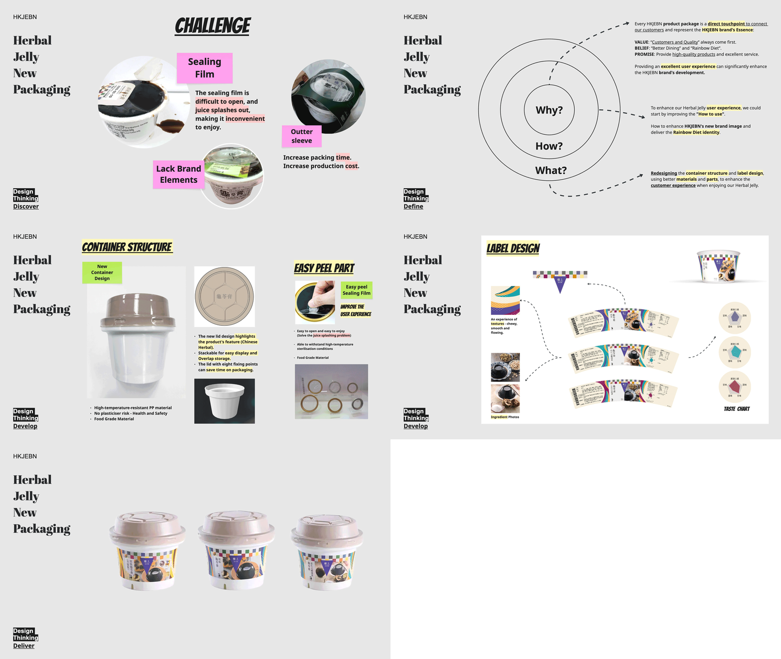
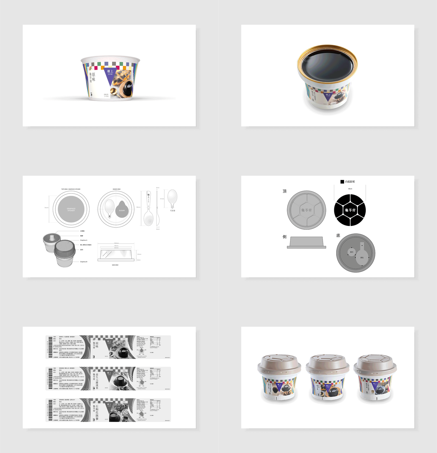
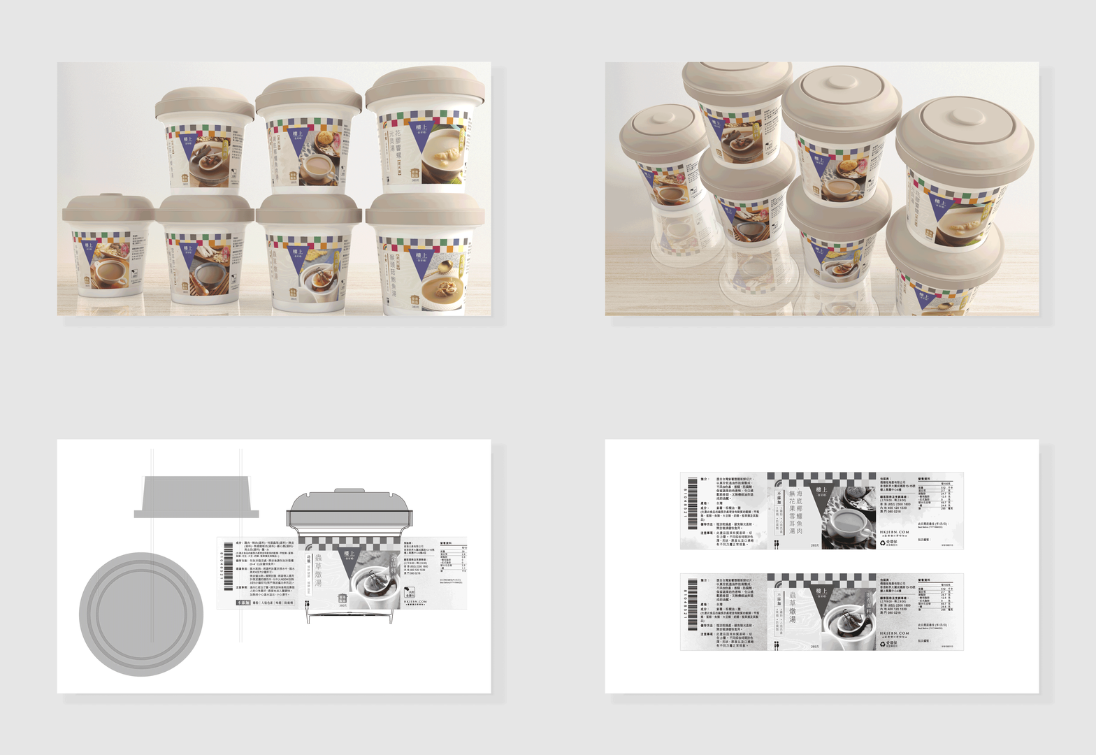
Packaging Redesign — Herbal Jelly Case
A design‑thinking‑led upgrade for one of HKJEBN’s core FMCG SKUs.
Challenges Identified
-
Hard‑to‑open sealing film
-
Messy user experience
-
Weak brand presence
-
Inefficient packing structure
“The sealing film is difficult to open, and juice splashes out, making it inconvenient to enjoy.”
Solutions
-
New stackable PP container
-
Easy‑peel sealing film
-
Rainbow Diet‑driven label system
-
Clear flavour hierarchy and taste charts
The redesign improved usability, reduced production time and strengthened brand alignment.