
Clinical Beauty
RILASTIL / BIODERMA / Phyto‑C
Client
RILASTIL / BIODERMA/ PHYTO-C
Agency
Transmission Creative HK / NEODERM HK
Industry
Clinical Beauty · Dermatology Skincare
Category
Brand Visual System & Digital

A cohesive visual language for clinical skincare — product stories, packaging visuals and clean, digital‑first assets.
Project Overview
This multi‑brand case study brings together my clinical beauty work across RILASTIL, BIODERMA and Phyto‑C — three dermatology‑led skincare brands with distinct histories but a shared need for clarity, trust and scientific credibility.
Across these brands, I developed product‑first visual systems, clean editorial compositions, and digital‑ready assets that balance clinical precision with modern beauty expression. The work spans product photography direction, retouching, packaging visuals, campaign assets, and modular identity systems for global rollout.
RILASTIL — Italian Dermatological Beauty
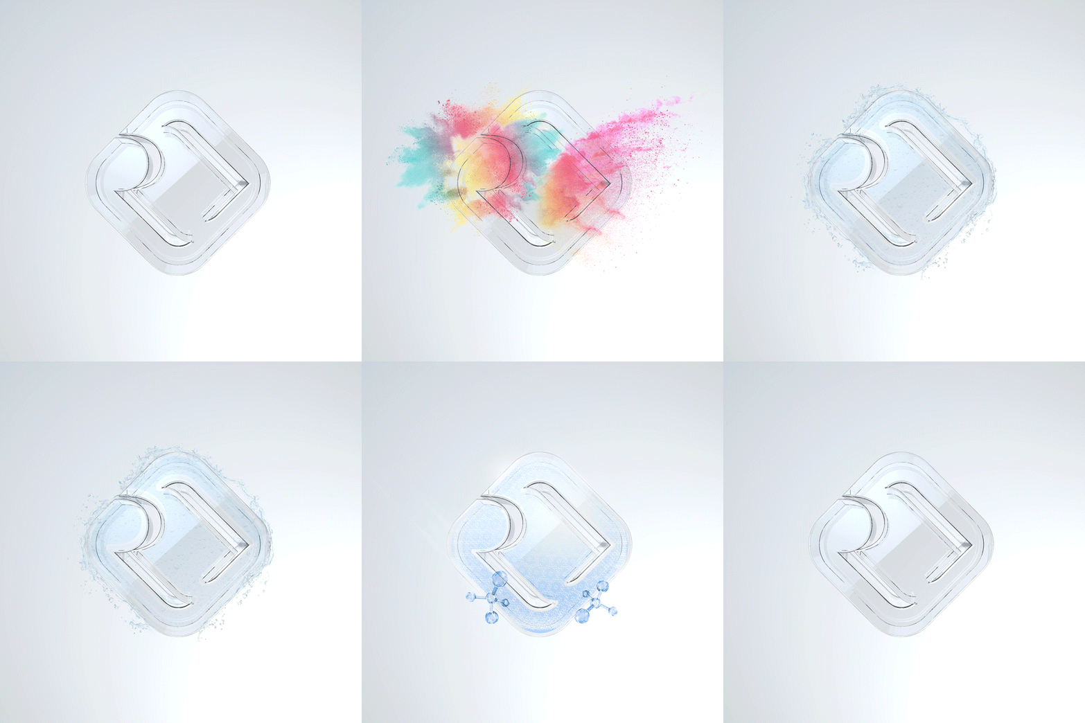
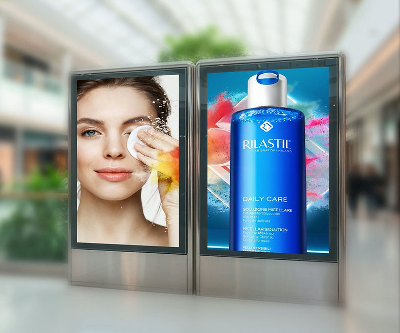
For RILASTIL, I created a cohesive visual identity that blends Italian dermatological heritage with a contemporary beauty aesthetic. The work includes:
-
Product photography direction and retouching
-
3D glass logo rendering
-
Texture‑led compositions for hydration and purity
-
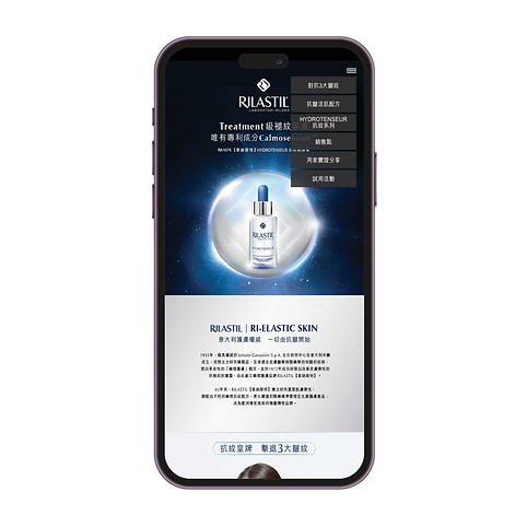
Digital and OOH assets for product launches
-
Clean blue‑white palette reinforcing clinical trust
The result is a scalable system that elevates RILASTIL’s scientific positioning while remaining warm, modern and beauty‑driven.








BIODERMA — Clinical Authority with Human Warmth
BIODERMA required visuals that communicate dermatological expertise without feeling cold or overly medical. My work focused on:
-
Product‑centric layouts for hydration and sensitive‑skin lines
-
Packaging‑aligned colour logic
-
Soft, natural lighting to humanise clinical products
-
Retail and digital assets for APAC campaigns
The visual language balances clinical purity with approachable warmth, supporting BIODERMA’s global brand consistency.


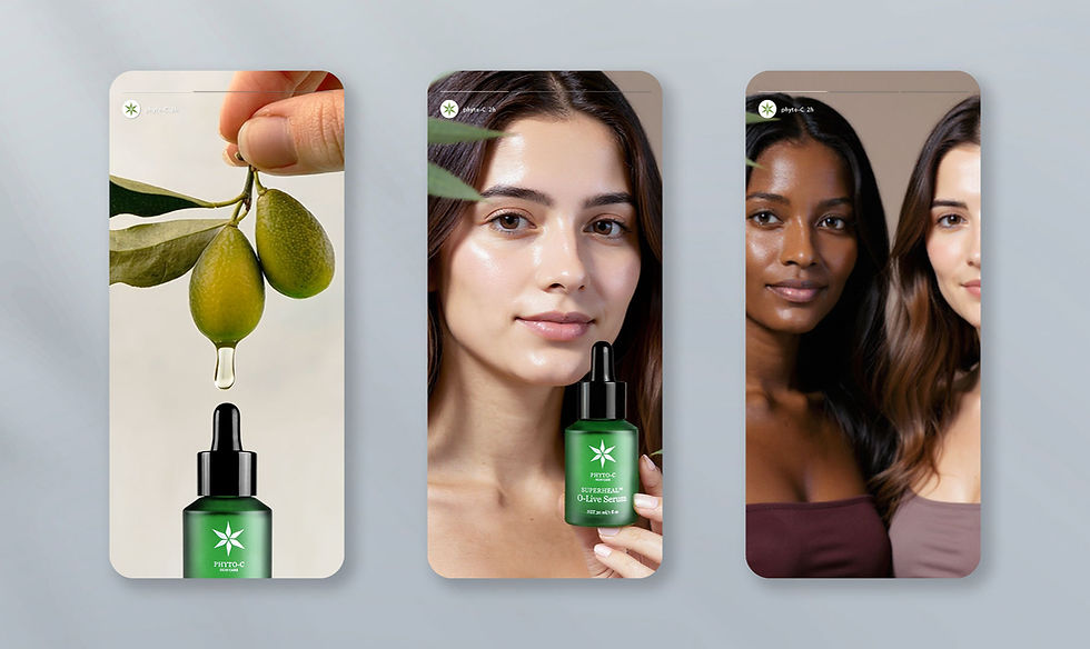
Phyto‑C — Clinical Precision Meets Botanical Science
BIODERMA required visuals that communicate dermatological expertise without feeling cold or overly medical. My work focused on:
-
Product‑centric layouts for hydration and sensitive‑skin lines
-
Packaging‑aligned colour logic
-
Soft, natural lighting to humanise clinical products
-
Retail and digital assets for APAC campaigns
The visual language balances clinical purity with approachable warmth, supporting BIODERMA’s global brand consistency.
Branding Development

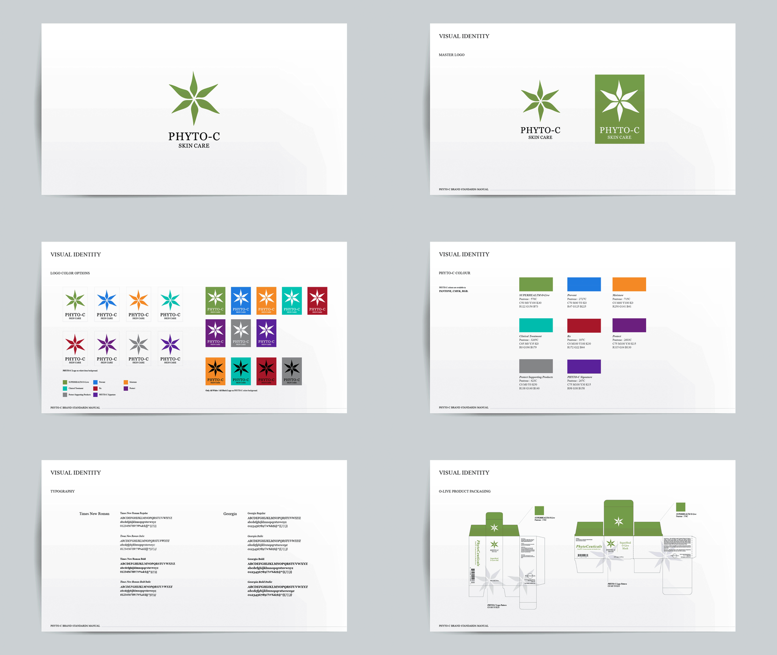


Visual Concept Development


Outcome
Across all three brands, the work demonstrates my ability to:
-
Build clinical beauty visual systems
-
Direct and retouch product photography
-
Create digital‑first assets for eCommerce and social
-
Maintain brand consistency across markets
-
Balance clinical credibility with modern beauty storytelling
This combined case reflects a holistic, multi‑brand understanding of the clinical skincare category — from packaging and product visuals to digital ecosystems and campaign execution.